Design For Interactive Data Visualization
Lynn Cherny
Visiting Knight Chair at UM School of Communication
Slides: https://ghostweather.slides.com/lynncherny
Overview first, zoom and filter, then details-on-demand
Overview first, zoom and filter, then details-on-demand
Overview first, zoom and filter, then details-on-demand
Overview first, zoom and filter, then details-on-demand
Overview first, zoom and filter, then details-on-demand Overview first, zoom and filter, then details-on-demand Overview first, zoom and filter, then details-on-demand Overview first, zoom and filter, then details-on-demand Overview first, zoom and filter, then details-on-demand Overview first, zoom and filter, then details-on-demand
Ben Shneiderman’s Infovis "mantra" (1996)
The Eyes Have It: A Task by Data Type Taxonomy for Information Visualizations
Shneiderman, B. 1996
click down to
go into a topic!
Heer & Shneiderman (2012)


Heer, J and B. Shneiderman, “Interactive Dynamics for Visual Analysis:A taxonomy of tools that support the fluent and flexible use of visualizations”
"Exploratory"
"Explanatory"
Visualization Goals


Moritz Stefaner's Map of the Vis Design Process (2013)
Exploratory
Explanatory
Excel
Python
R / Shiny
Tableau
SAS/SPSS
Illustrator
Javascript / D3.js
R (ggplot2)
Tableau
(Jupyter / IPython notebook)
"interactives" / "infographics"
/ "articles"
"data sketches" / notes /
sometimes
scientific publications
A Map for Interactives
- Overview and Zoom
- Sort and Filter
- Details on Demand
- Small Multiples
- Linked Views
- Storytelling Techniques
- UI: Steppers
- UI: Scrolling
- UI: Animated Transitions
- UI: Annotation
- Method: Personalization
- Method: Recast / Rescale / Regroup
- Method: Movies
- Method: Simulation
- Are you building a story, or building a tool?
Overview and Zoom


Sometimes, we start from small and zoom out.
Sort and Filter
and search!


Unusual Filter Designs

Crossfilter airline data demo: http://square.github.com/crossfilter/, and look up dc.js for using it better.
Linked Exploratory Query Tools (Related to Filtering)
Parallel Coordinates:
Another Exploratory Tool

Kai Chang @syntagmatic http://bl.ocks.org/syntagmatic/raw/3150059/
Filter By Legend (Increasingly Common)


Details on Demand

Tooltips are an amazing opportunity... don't waste them!
Tooltips with little charts!
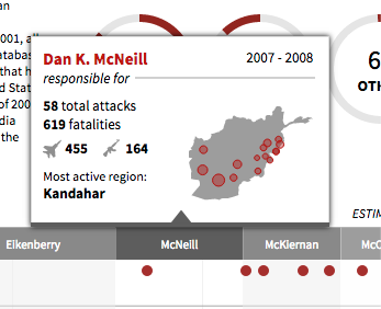
Pitch Interactive for

Incredibly useful during development / exploration

Example for my class using simple "title" field in svg for "fake tooltips"
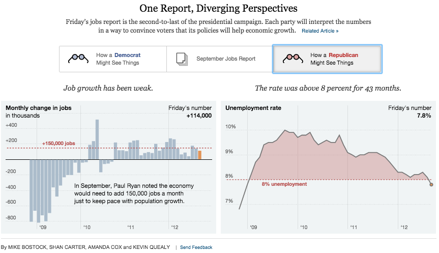
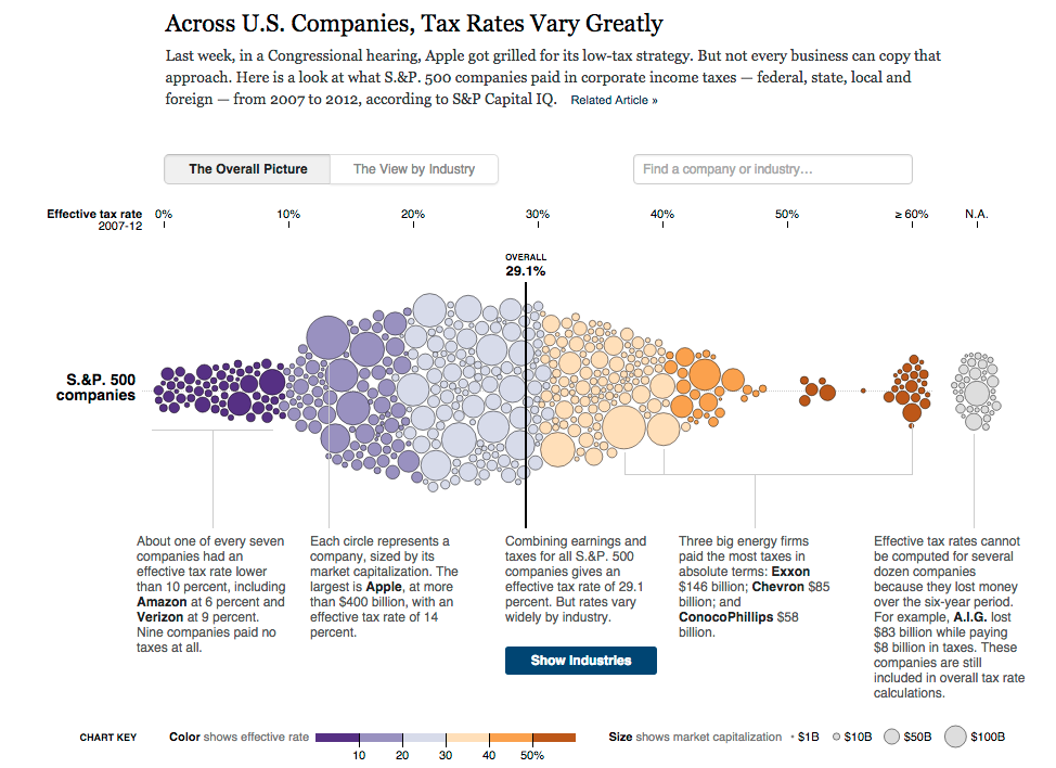
Small Multiples
perform both overview & detail functions

Can even be sorted, too!

Coordinated, linked views
For multidimensional exploration

Linked Across the Small Multiples

Time Linked to Place

http://mbtaviz.github.io/ by Mike Barry and Brian Card
Linked at annotation layer too

Exploratory Tools
Storytelling
Techniques
UI Mechanism:
"Steppers"
Switching to mostly "explanatory" design tips now....


Tableau's Story Points

Storytelling
UI Mechanism:
Scrolling, or "Scrollytelling"


FYI, The Peanut Gallery does not love scrollytelling.
See also the anonymous famous NYT graphics team member quote in Jim Vallandingham's Openvis talk So You Think You Can Scroll
Storytelling
UI Trick: Animated Transitions
[Experiments] found significant advantages for animation across both syntactic and semantic tasks, providing strong evidence that, with careful design, animated transitions can improve graphical perception of changes between statistical data graphics.
"Animated Transitions in Statistical Data Graphics" (Heer & Robertson 2007)

Storytelling
UI: The Annotation Layer
Text labels and callouts are NOT second class design elements.


True in Static and Interactives
Links from text to key views


Storytelling
Mechanism: Movies (animation of events, or actual video / gif included)
Chris Whong http://nyctaxi.herokuapp.com/

Small Data in Action

Video Segments

Tiny animations are taking off too...

Storytelling
Methods: Personalization


You set up your own model.
You are the graphic.

Storytelling
Methods:
"Recast" / "Rescale" / "Regroup"
Democrats vs. Republicans
(heavy use of annotation layer)


Overall vs. Small Multiples


Where would 10.8 million displaced Syrians fit?

An actual rescale - log / linear
Storytelling
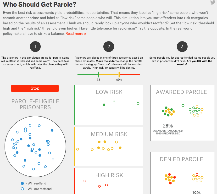
Methods: Simulation

What's Your Goal?
Tell a story...
or build a tool?
Back up a bit:
Finding a story


From A Kirk's Data Visualization: A Successful Design Process (2012)


Entries to the Hollywood contest from Information is Beautiful in 2012 - most are dead links now btw.
In Excel

It is the most profitable film ever made, based on return on investment

James Fisher's entry, not online anymore (repo)

An inconvenient truth

With interactives, you don't need a ladder, geez.
Al Gore screencap from "An Inconvenient Truth", thanks to Moritz Stefaner
"Martini Glass" Structure
Author
Reader


So, both explantory and exploratory are possible!
- Overview and Zoom
- Sort and Filter
- Details on Demand
- Small Multiples
- Linked Views
- Storytelling Techniques
- UI: Steppers
- UI: Scrolling
- UI: Animated Transitions
- UI: Annotation
- Method: Personalization
- Method: Recast / Rescale / Regroup
- Method: Movies
- Method: Simulation
- Are you building a story, or building a tool?

Thanks!
Lynn Cherny / @arnicas
lynn@cherny.com
openvisconf.com
Take my class next semester if you're a UM student.
Slides: https://ghostweather.slides.com/lynncherny
Design for Interactive Data Vis
By Lynn Cherny
Design for Interactive Data Vis
An introductory talk on interactive visualization principles, particularly applicable to journalism. Lots of examples.


